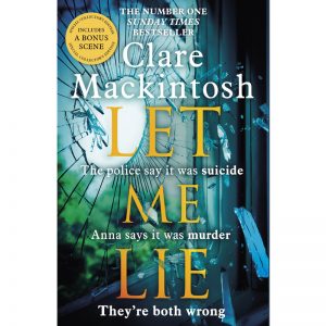
So far, in this series on the publishing roles involved in building a book, we’ve heard from Cath Burke, in what does an editor do? and Thalia Proctor, in what does a desk editor do? Now that we have a finished manuscript, it’s time to think about the way it’s going to look on the shelf. So, how are book covers designed?
Meet the cover designer
Hannah Wood is a designer with Little, Brown Book Group. She worked on my debut novel, I Let You Go, and on my most recent book, Let Me Lie.
What does your job entail?

My job is to interpret the brief given by the editorial team and create the cover artwork, this will be from initiating ideas, working up roughs, refining our chosen options right though to preparing the artwork for printing.
How are book covers designed?
Every brief is different, some have a clear idea attached to them with lots of content about the story, others just have a mood that we need to convey and are very open. Most often, the first steps I take will be looking at the market to see what else is out there. In the case of Let Me Lie, we already had a typography style to work with, so really my first step was to start picture researching. Pulling together as many images together as I could that could fit the book and the style of I Let You Go and I See You. Where a style isn’t already established, I nearly always begin with the typography, working out the best, most impactful layout for the title so when I look for images, I know what kind of space I am looking for.
Where do you find inspiration?
I find my inspiration everywhere. From TV and film to magazines, stationary and packaging (I have a soft spot for fancy food packaging) to art. I try to take inspiration less from other book covers.
Which aspects of your job do you enjoy the most?
The ideas stage – coming up with all the possibilities for a cover is the best bit, experimenting and seeing what is possible.
How do you feel when you see your covers in bookshops?
It feels like a great achievement when you see the work of all the team come together and reach the shelves. Better still, is when you see someone actually reading the book on the train, it means more to see it in the hands of the reader, it means they have actually connected with the book and picked it up and bought it.
Tell us something about the process of working on the cover for LET ME LIE.
Creating a cover for the third book of an author who has had phenomenal success is by no means easy. We wanted to continue building Clare a recognisable style but at the same time, each book needs to have something unique. Let Me Like, like the rest of Clare’s titles, was a dream to work with, short with short words, therefore easy to make impactful. The imagery needed to have a beauty about it as well as a dark suspenseful edge and I hope that the shards of glass achieve this with them flying through the air bringing lots of energy.
Note from the author: I love the covers Hannah has produced for me, and I think Let Me Lie is my favourite to date. The shards of glass are embossed, and when you pick up the book they really catch the light – it’s an amazing cover. Hannah recently created an incredible cover for an 80th anniversary edition of Daphne du Maurier’s Rebecca. You can read about how she approached the project here.
